NAME
Term::Fabulous::Manual::TableStyles - Tables: colors, lines, size and printing
DESCRIPTION
This page is part of Term::Fabulous::Manual. Previous page: Term::Fabulous::Manual::TableRows. Next page: Term::Fabulous::Manual::KDL.
This page explains how a Term::Fabulous::Widget::Table looks: its colors, the style hashes of columns, rows and cells, the lines between and around the cells, and the padding ("STYLES AND BORDERS"); how large it is and how its rows scroll ("SIZE AND SCROLLING"); and how to print it as a report ("PRINTING A TABLE").
The table guide has two more pages: Term::Fabulous::Manual::Tables explains how a table works, rows, columns, display text and widgets in cells, and lists every table feature in its FEATURE INDEX; Term::Fabulous::Manual::TableRows explains sorting, filtering, groups, trees, pages, the cursor and the selection. The exact contract of every parameter and method is on Term::Fabulous::Widget::Table, and complete programs for the features of this page are in Term::Fabulous::Cookbook::TableStyles.
STYLES AND BORDERS
Parameters:        text_color, header_text_color, header_background_color,
                   group_text_color, group_background_color, cursor_color,
                   selected_color, hover_color, filter_background_color,
                   error_color, muted_color, line_color, stripe_color,
                   background_color, row_style, header_style, group_style,
                   border, border_top, border_right, border_bottom,
                   border_left, column_lines, row_lines, header_line,
                   cell_padding
Column parameters: style, header_style, cell_style
Methods:           set_row_style, row_style_of, set_cell_style,
                   cell_style_of, and accessors for all parameters above
KDL:               the colors, lines, cell_padding, column { style; header_style }
Colors
The table's colors are parameters, and accessors of the same name change them at run time. They take every format of Term::Fabulous::Color ('#e06c75', [ 224, 108, 117, 255 ], 'rgb(224, 108, 117)', ...) and return [ $r, $g, $b, $a ].
text_color                [220, 223, 228]  text of the data cells, of the filter fields and of
                                           the pager; the scrollbar's thumb
header_text_color         [235, 238, 243]  text of the column titles
header_background_color   [ 36,  40,  50]  background of the column titles, also behind the
                                           line below them
group_text_color          [ 97, 175, 239]  text of group headers
group_background_color    [ 28,  32,  41]  background of group headers and the column chooser
cursor_color              [ 52,  58,  72]  background of the cursor's line (while focused), of
                                           the column title the keyboard is on, and of a
                                           focused filter field
selected_color            [ 38,  62,  92]  background of selected rows
hover_color               [ 38,  42,  52]  background of the line under the mouse pointer
filter_background_color   [ 30,  33,  40]  background of the filter row
error_color               [224, 108, 117]  text of a filter field with an invalid expression
muted_color               [140, 146, 158]  the text of an empty table; the pager's count, its
                                           label and its disabled buttons
line_color                [ 88,  96, 112]  every line, unless a style has a border_color;
                                           the scrollbar's track
stripe_color              none             background of every second data row (see below)
background_color          see below        background of the data cells
The cells always have a background of their own; that is what makes them receive the mouse. A cell without a color from a style or a state (cursor, selected, hover, stripe) gets what the table lies on (see "background_below" in Term::Fabulous::Widget): the table's background_color when it has one, else the background of the nearest ancestor widget with an opaque background, else the screen color of the theme, else (in a Term::Fabulous::Static, which paints no screen) [22, 25, 31]. So a table without a background_color blends into the box or the screen it is on.
hover (default 1) turns the hover highlight on or off.
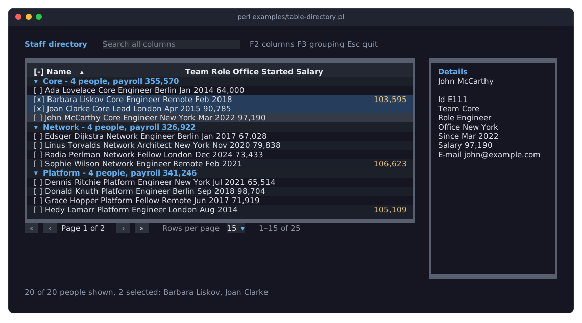
The picture shows several of these colors at work: the column titles on the header_background_color, group headers in the group_text_color on the group_background_color, two selected rows in the selected_color, and the cursor's line in the cursor_color. It is examples/table-directory.pl, described in Term::Fabulous::Examples.
Striped rows
stripe_color => '#1c2029',With a stripe_color, every second data row of the page (the second, the fourth, ...) gets that background, so long rows are easier to follow. Group headers do not count. A row or cell style with a background_color covers the stripe; the cursor, selected and hover colors cover both. The picture in "Tables with colored backgrounds" shows striped rows.
Style hashes
Looks and lines of parts of the table are given as style hashes, hash references such as { text_color => '#e5c07b', bold => 1 }. They go here:
Where                                         For                      Kind
------------------------------------------------------------------------------
column parameter style => {...}               every cell of the column column
column parameter header_style => {...}        the column's title       header
column parameter cell_style => sub ($cell)    one cell, per row        cell
table parameter header_style => {...}         every column title       row
table parameter group_style => {...}          every group header       row
table parameter row_style => sub ($row, $id)  one row                  row
$table->set_row_style( $id, {...} )           one row                  row
$table->set_cell_style( $id, $key, {...} )    one cell                 cell
cell_style gets the cell context (see "CELL WIDGETS" in Term::Fabulous::Manual::Tables); row_style gets a copy of the row's data and its id. Both return a style hash, or undef for none. They run again when the row's data changes. A returned hash with an unknown key or an invalid value dies when the table is drawn.
The table's header_style is the style of the title row and of the filter row. Its looks apply to the titles only; its lines apply to both rows (a border_bottom draws a line below each). The filter row's background is the filter_background_color, and its lines always have the line_color.
Style keys
Every kind of style hash takes these keys for the looks:
text_color         a color
background_color   a color
bold               a boolean
italic             a boolean
underline          a boolean
border_color       a color: of the lines this part draws
and these keys for lines, depending on the kind:
Kind     Line keys
-------------------------------------------------------------------------------
cell     border_top, border_right, border_bottom, border_left
row      border_top, border_right, border_bottom, border_left, column_lines
column   border_left, border_right, row_lines
header   (none)
Here column_lines are the lines between the cells of a row, and row_lines the lines between the cells of a column. A line is the name of a line style ('Solid', 'Round', 'Heavy', 'Double', 'Dashed', 'Ascii' or any other of Term::Fabulous::Enum::BorderStyle), a Term::Fabulous::Enum::BorderStyle object, or 'none' for no line. A key with the value undef is the same as a missing key: that part does not decide it. Unknown keys and invalid values die where the style is given, naming the style and the key; Term::Fabulous::Widget::Table::Style checks them.
Which style wins
For the looks of a data cell, each key is taken from the first of these that sets it:
1. set_cell_style           (the cell)
2. the column's cell_style  (the cell)
3. set_row_style            (the row)
4. row_style                (the row)
5. the column's style       (the column)
6. the table's colors: text_color, line_color, not bold, not italic, not underlined
The background of a data cell is, in this order: the cursor_color on the cursor's line while the table has the focus; the selected_color for a selected row; the hover_color for the line under the mouse; the background_color of the styles above; the stripe_color of a striped row; the table's background (see "Colors").
A column title takes each key from the column's header_style, then the table's header_style, then header_text_color, header_background_color and line_color; titles are bold unless a style says bold => 0. A group header takes them from group_style, then group_text_color, group_background_color and line_color; it is bold, too, unless group_style says otherwise. The cursor_color and the hover_color cover the background of a group header like that of a data row.
Styles of rows and cells
Use row_style and cell_style for formatting that follows the data, and set_row_style and set_cell_style for marks your program sets on single rows and cells:
# Overdue tasks in red, done ones in gray (by the data)
row_style => sub ( $row, $id ) {
	return { text_color => '#808080', italic => 1 } if $row->{done};
	return { text_color => '#e06c75', bold => 1 } if $row->{due} < time;
	return undef;
},

# Negative amounts in red (by the cell)
{ key => 'amount', type => 'number', mutator => number( decimals => 2 ),
  cell_style => sub ($cell) { ( $cell->{value} // 0 ) < 0 ? { text_color => '#e06c75' } : undef } },

# Marks set from Perl
$table->set_row_style( $id, { background_color => '#3b3222' } );       # highlight a row
$table->set_cell_style( $id, 'amount', { bold => 1, underline => 1 } );
$table->set_row_style( $id, {} );                                        # remove the mark
my $style = $table->row_style_of($id);       # what set_row_style set (a copy; {} when nothing)
my $cell  = $table->cell_style_of( $id, 'amount' );
set_row_style and set_cell_style replace what was set for the row or cell before; an empty hash removes it. They keep their styles until the row is removed. To change the row_style code later, call $table->row_style( sub { ... } ); a column's cell_style with update_column.
Lines between and around the cells
The table draws its lines itself, joined into one grid: where lines meet, it uses the matching junction glyphs (┬ ┼ ╪ ╞ ...), also where lines of different styles meet. These table parameters set the lines:
border         [Round]   the frame around the table, all four sides
border_top     [border]  one side of the frame, overriding border
border_right   [border]
border_bottom  [border]
border_left    [border]
column_lines   [Solid]   the lines between the columns
row_lines      [none]    the lines between the rows
header_line    [Solid]   the line below the column titles (and the filter row)
line_color               the color of all lines (see Colors)
Each takes a line style name, a Term::Fabulous::Enum::BorderStyle object, 'none' for no line, or undef. undef means no line, with two exceptions: in the constructor, an undef side of the frame takes the style of border; and an undef header_line, given to the constructor or set later, takes the style of row_lines. Use 'none' to be sure there is no line. With a filter row, header_line is the line below the filter row, and row_lines (and a column's row_lines) draw the line between the titles and the filter row.
Which styles to use:
- Line styles, for every line
-
Solid,Round,Heavy,Double,DashedandAsciidraw their lines through the middle of the terminal cells and join into one grid, also with each other: aHeavyframe withSolidcolumn lines gets┯and┷where they meet, and┠and┨where the line below the titles meets the frame.Roundjoins likeSolid(with round corners),DashedlikeHeavy. Unicode has junction glyphs for light lines meeting heavy ones and for light lines meeting double ones, but none for heavy lines meeting double ones: there the table uses the glyph of the horizontal line's style (a heavy vertical line crossing a double horizontal line is drawn as╬). - Block styles, for the frame only
-
Outer,InnerandThickdraw the frame with half and full blocks that lie on the edge of the terminal cells (see "STYLES" in Term::Fabulous::Enum::BorderStyle). Lines inside the table end at such a frame, which runs on straight where they meet it. Use them only forborderand the fourborder_*sides; for inner lines, use the line styles. They suit tables with colored cells best (see "Tables with colored backgrounds"). - Other styles
-
The other styles of Term::Fabulous::Enum::BorderStyle (
Panel,Tall,Wide,Block, the shades, ...) are not made for tables: they are drawn, but where they meet other lines the result is not clean.
# A grid like a spreadsheet
border => 'Solid', row_lines => 'Solid',

# No lines at all, a compact list
border => 'none', column_lines => 'none', header_line => 'none',

# A double frame and a heavy line under the titles
border => 'Double', header_line => 'Heavy',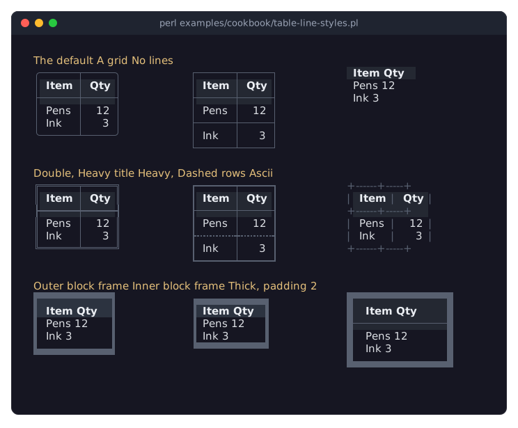
The picture shows these and more line options side by side; the program is in the recipe Compare the line options of a table.
Grid lines take space: every grid line is one terminal row (or one terminal cell wide). A line that is only drawn in some places (see "Lines of columns, rows and cells") still keeps its space everywhere, drawn blank where there is no line, so that the cells stay aligned.
The table's own border is not the bordered that every other Term::Fabulous::Widget::Box has: a table takes no bordered (giving it dies, naming border), and no theme frames it, so the table's own frame is the only one.
Tables with colored backgrounds
A thin line glyph (│, ─) sits in the middle of its terminal cell, and the whole cell has one background color. So with colored cells (column titles on a background, striped rows, a highlighted row), the color of a cell next to a line also shows on the line's other side, half a cell beyond it: a highlighted row's color runs through the column lines, and the line under the titles sits inside the titles' color.
For tables whose rows and titles have colors of their own, a frame in a block style and no inner lines usually looks best. The block glyphs of Outer and Inner lie on the edge of the cells, so every color inside ends exactly at the frame, and the colors themselves separate the titles from the rows and the rows from each other:
my $table = Term::Fabulous::Widget::Table->new(
	id                      => 'staff',
	border                  => 'Outer',     # or 'Inner': the frame inside the table's edge
	column_lines            => 'none',
	header_line             => 'none',
	line_color              => '#4b5568',
	header_background_color => '#2c3340',
	stripe_color            => '#1c2029',
	cell_padding            => 2,           # space instead of column lines
	columns                 => [...],
);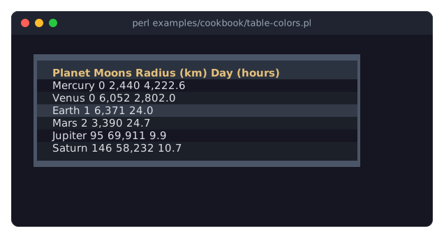
Both enclose the colors. Outer draws its blocks on the outer half of the frame's cells, and the cells' colors fill the inner half up to the blocks; Inner draws on the inner half, right next to the cells, with the background around the table on the outer half. Column lines can still be used with a block frame (they end at it), but they carry the cell colors as described at the start of this section. The recipe A table with colored rows and titles has the complete program.
Lines of columns, rows and cells
The style hashes of columns, rows and cells can add, change or remove lines in their place (see "Style keys" for which keys each kind takes):
# A heavy line left of the 'total' column, and lines between its cells
{ key => 'total', style => { border_left => 'Heavy', row_lines => 'Dashed' } }

# A double line above the totals row
$table->set_row_style( $total_id, { border_top => 'Double', bold => 1 } );

# A heavy box around one cell
$table->set_cell_style( $id, 'total', { map { ( "border_$_" => 'Heavy' ) } qw(top right bottom left) } );

# No line between the cells of one row
$table->set_row_style( $id, { column_lines => 'none' } );

# A line under every group header
group_style => { border_bottom => 'Solid' },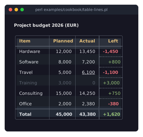
The picture shows lines of a column (a heavy line left of it, dashed lines between its cells), of a row (a double line above the totals) and styles of rows and cells (colors, italic, bold); the program is in the recipe Lines and colors per row, column and cell.
Each piece of a line between two cells takes the first style that is named, in this order:
1. the cell styles of the two cells next to it   (border_*)
2. the row styles of their rows                  (border_*, column_lines)
3. the column styles of their columns            (border_left, border_right, row_lines)
4. the table's lines                             (border*, column_lines, row_lines, header_line)
When the two cells (or rows, or columns) on both sides of a piece name different styles, the one below or to the right wins. 'none' also counts as named: it removes the line there, even when a less specific level has one.
A piece of line takes the border_color of the cell that draws it: the cell to its right for a vertical line (the last cell of a row for the right side of the frame), and the cell below it for a horizontal line, with three exceptions: the column titles draw the line below them, the last row draws the bottom of the frame, and the row above a group header draws the line between them. So border_color in a row style colors the line above the row and the lines left of its cells.
Cell padding
cell_padding => 1,                                         # one column left and right (the default)
cell_padding => 0,                                         # none: text touches the lines
cell_padding => { left => 1, right => 1, top => 1, bottom => 0 },    # an empty line above each cell
cell_padding is the empty space inside every cell, header and group cells included, around its content. A number sets the left and the right padding; a hash sets the sides it names and 0 for the others. The picture in "Tables with colored backgrounds" shows a padding of 2, which keeps the columns apart without lines.
SIZE AND SCROLLING
Parameters: layout (of every Box), scrollbar
Methods:    scroll_to_row, cursor, body
Unless told otherwise, a table is as wide as its columns and as high as its lines, its column titles and its pager. When its parent has less room, it gets smaller and its rows scroll: the column titles stay at the top, the rows scroll up and down below them, and sideways together with the titles. The frame stays around the visible part: its four sides stay at the edges of the table while the rows scroll inside it.
To make a table fill its parent, or take part of it, give it a sizing like any Term::Fabulous::Widget::Box (see "Sizing" in Term::Fabulous::Manual::Layout):
use Clay::XS qw(sizing_grow sizing_fixed);

my $table = Term::Fabulous::Widget::Table->new(
	id      => 'log',
	columns => [ { key => 'time' }, { key => 'message', width => 'grow' } ],
	layout  => { sizing => { width => sizing_grow(), height => sizing_grow() } },
);
A table wider than its columns lets grow and percent columns take the extra width; without such columns, the columns keep their width and the table's background shows to their right. A table higher than its lines shows its background below the last line (or the pager).
The rows scroll with the mouse wheel over them (a horizontal wheel, or a sideways tilt, scrolls sideways) and follow the cursor: when the cursor moves out of sight, the rows scroll until its line is visible. A new page starts at its top. From Perl, $table->scroll_to_row($id) moves the cursor to a row and scrolls it into view.
The scrollbar is one column right of the frame. While the rows do not fit, it shows a track with a thumb for the visible part; clicking or dragging on it scrolls. scrollbar => 0 removes it, and the column it takes. Its colors are the table's line_color (the track) and text_color (the thumb); see Term::Fabulous::Widget::Scrollbar.
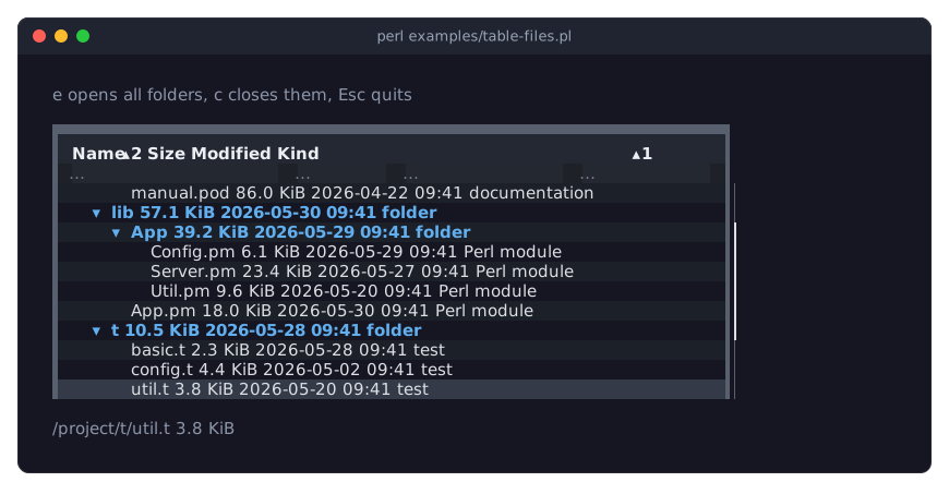
The picture shows a table higher than its room, scrolled down to the cursor's line: the column titles and the filter row stay at the top, and the thumb of the scrollbar shows which part of the rows is visible. It is examples/table-files.pl, described in Term::Fabulous::Examples.
PRINTING A TABLE
A table works with Term::Fabulous::Static, which draws a widget tree once and prints it, to a terminal, a file or a pipe. That makes a table a good way to print a report:
use Term::Fabulous::Static;

my $table = Term::Fabulous::Widget::Table->new(
	id        => 'report',
	columns   => [...],
	rows      => \@rows,
	sort      => ['name'],
	scrollbar => 0,          # nothing scrolls on paper
	hover     => 0,
);
Term::Fabulous::Static->new( root => $table, width => 100 )->print;
Without the focus, no cursor is drawn. Leave out page_size to print all rows (or set it and page to print one page), and filter_row and selection.
The cells always have an opaque background (see "Colors"): without a background_color on the table or a widget around it, a printed table is a dark block, also on a light terminal. Give the table (or the root widget) a background_color that suits the report. The column titles show the sort markers of a sorted table; there is no option to hide them.
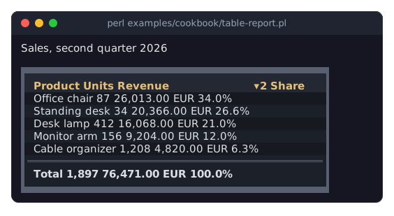
The program behind the picture is in the recipe Print a table as a report.
SEE ALSO
This page is part of Term::Fabulous::Manual. Previous page: Term::Fabulous::Manual::TableRows. Next page: Term::Fabulous::Manual::KDL.
Term::Fabulous::Widget::Table, Term::Fabulous::Widget::Table::Style, Term::Fabulous::Widget::Scrollbar, Term::Fabulous::Enum::BorderStyle, Term::Fabulous::Static, Term::Fabulous::Cookbook::TableStyles.