NAME
IUP::Vbox - [GUI element] container for composing elements vertically
DESCRIPTION
Creates a void container for composing elements vertically. It is a box that arranges the elements it contains from top to bottom.
It does not have a native representation.

| default layout | HOMOGENEOUS=YES | EXPANDCHILDREN=YES |
|---|---|---|
 |
 |
 |
| default layout | child "2": VISIBLE=NO | child "2": VISIBLE=NO, FLOATING=YES |
 |
 |
 |
USAGE
CREATION - new() method
#standard way
my $vbox = IUP::Vbox->new( child=>[$elem1, $elem2], ANYATTRIBUTE=>'any value' );

#or with just a single child
my $vbox = IUP::Vbox->new( child=>$elem, ANYATTRIBUTE=>'any value' );

#or with just 1 parameter (arrayref)
my $vbox = IUP::Vbox->new( [$elem1, $elem2] );

#or with just 1 parameter (reference to child elements)
my $vbox = IUP::Vbox->new( $elem );
child: (named parameter) List of the references to elements (or just a single element) that will be placed in the box. Can be undef.
Returns: the identifier of the created element, or undef if an error occurs.
NOTE: You can pass to new() other ATTRIBUTE=>'value' or CALLBACKNAME=>\&func pairs relevant to this element - see IUP::Manual::02_Elements.
ATTRIBUTES
For more info about concept of attributes (setting/getting values etc.) see IUP::Manual::03_Attributes. Attributes specific to this element:
- ALIGNMENT
-
(non inheritable)
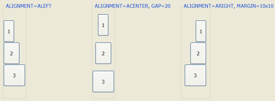
Horizontally aligns the elements. Possible values: "ALEFT", "ACENTER", "ARIGHT". Default: "ALEFT".
- EXPAND
-
(non inheritable*)
The default value is "YES". See the documentation of the attribute for EXPAND inheritance.
- EXPANDCHILDREN
-
(non inheritable)
Forces all children to expand horizontally. Default: "NO". This has the same effect as setting EXPAND=HORIZONTAL on each child, but their vertical expansion will be preserved.
- EXPANDWEIGHT
-
(non inheritable) (at children only)
If a child defines the expand weight, then it is used to multiply the free space used for expansion. (since iup-3.1)
- FLOATING
-
(non inheritable) (at children only)
If a child has FLOATING=YES then its size and position will be ignored by the layout processing. Default: "NO".
- GAP, CGAP
-
Defines a vertical space in pixels between the children, =item CGAP is in the same units of the SIZE attribute for the height. Default "0". (CGAP since iup-3.0)
- NGAP, NCGAP
-
(non inheritable)
Same as GAP but are non inheritable.
- HOMOGENEOUS
-
(non inheritable)
Forces all children to get equal vertical space. The natural size height will be based on the highest child. Default: "NO". Notice that this does not changes the children size, only the available space for each one of them to expand. (since iup-3.0)
- MARGIN, CMARGIN
-
Defines a margin in pixels, CMARGIN is in the same units of the SIZE attribute. Its value has the format "widthxheight", where width and height are integer values corresponding to the horizontal and vertical margins, respectively. Default: "0x0" (no margin). (CMARGIN since iup-3.0)
- NMARGIN, NCMARGIN
-
(non inheritable)
Same as MARGIN but are non inheritable.
- NORMALIZESIZE
-
(non inheritable)
normalizes all children natural size to be the biggest natural size among them. All natural width will be set to the biggest width, and all natural height will be set to the biggest height according to is value. Can be NO, HORIZONTAL, VERTICAL or BOTH. Default: "NO".
- SIZE / RASTERSIZE (non inheritable)
-
Defines the height of the box. When consulted behaves as the standard SIZE/RASTERSIZE attributes. The standard format "wxh" can also be used, but width will be ignored (since iup-3.3).
- WID
-
(read-only)
Returns -1 if mapped.
The following common attributes are also accepted:
NOTES
The box can be created with no elements and be dynamic filled using Append or Insert.
The box will NOT expand its children, it will allow its children to expand according to the space left in the box parent. So for the expansion to occur, the children must be expandable with EXPAND!=NO, and there must be room in the box parent.
EXAMPLES
The element IUP::Vbox is used in the following sample scripts:
0-basic/button.pl - IUP::Button example
0-basic/canvas1.pl - IUP::Canvas example
0-basic/canvas2.pl - IUP::Canvas example
0-basic/canvas3.pl - IUP::Canvas example
0-basic/cbox.pl - IUP::Cbox example
0-basic/cells_degrade.pl - IUP::Cells example
0-basic/colorbrowser.pl - IUP::ColorBrowser example
0-basic/dial.pl - IUP::Dial example
0-basic/dialog1.pl - IUP::Dialog example
0-basic/dialog2.pl - IUP::Dialog example
0-basic/expander.pl - IUP::Expander example
0-basic/fill.pl - IUP::Fill Example
0-basic/gauge.pl - IUP::Gauge example
0-basic/hbox.pl - IUP::Hbox example
0-basic/idle.pl - IUP->SetIdle Example
0-basic/image.pl - IUP::Image example
0-basic/label.pl - IUP::Label and IUP::Link example
0-basic/layoutdialog.pl - IUP::LayoutDialog example
0-basic/list2.pl - IUP::List example
0-basic/matrix_basic.pl - IUP::Matrix example
0-basic/matrixlist.pl - IUP::MatrixList example
0-basic/plot_advanced.pl - Plot controls
0-basic/progressbar2.pl - IUP::ProgressBar example
0-basic/progressbar3.pl - IUP::ProgressBar example
0-basic/radio.pl - IUP::Radio example
0-basic/sbox1.pl - IUP::Sbox example
0-basic/sbox2.pl - IUP::Sbox example
0-basic/tabs1.pl - IUP::Tabs example
0-basic/tabs3.pl - IUP::Tabs example
0-basic/text2.pl - IUP::Text example
0-basic/text_format.pl - IUP::Text (formating) example
0-basic/toggle.pl - IUP::Toggle example
0-basic/tree1.pl - IUP::Tree example (animals) - using helper methods e.g. TreeAddNodes()
0-basic/tree_set_attrs.pl - IUP::Tree example (attributes)
0-basic/val.pl - IUP::Val example
0-basic/vbox.pl - IUP::Vbox example
0-basic/zbox.pl - IUP::Zbox example
1-apps/app-mdi.pl - IUP app example
1-apps/app-plot-demo.pl - dials for zooming
1-apps/app-sample1.pl - example used for screenshot - IUP.pod
1-apps/app-sample2.pl - example based on the original sample.c
1-apps/app-simple-demo.pl - example used for screenshot - IUP.pod
SEE ALSO
The original doc: iupvbox.html