NAME
Prima::Buttons - buttons, checkboxes, radios
SYNOPSIS
use Prima qw(Application Buttons StdBitmap);

my $window = Prima::MainWindow-> new;
Prima::Button-> new(
	owner => $window,
	text  => 'Simple button',
	pack  => {},
);
$window-> insert( 'Prima::SpeedButton' ,
	pack => {},
	image => Prima::StdBitmap::icon(0),
);

Prima->run;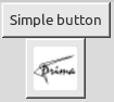
DESCRIPTION
Prima::Buttons provides button widgets that include push buttons, check-boxes, and radio buttons. It also provides the Prima::GroupBox class used as a container for the checkboxes and radio buttons.
The module provides the following classes:
*Prima::AbstractButton
	Prima::Button
		Prima::SpeedButton
			Prima::PopupButton
	*Prima::Cluster
		Prima::CheckBox
		Prima::Radio
Prima::GroupBox
Note: * - marked classes are abstract.
USAGE
use Prima::Buttons;

my $button = $widget-> insert( 'Prima::Button',
	text => 'Push button',
	onClick => sub { print "hey!\n" },
);
$button-> flat(1);

my $group = $widget-> insert( 'Prima::GroupBox',
	onRadioClick => sub { print $_[1]-> text, "\n"; }
);
$group-> insert( 'Prima::Radio', text => 'Selection 1');
$group-> insert( 'Prima::Radio', text => 'Selection 2', pressed => 1);
$group-> index(0);
Prima::AbstractButton
Prima::AbstractButton realizes the common functionality of buttons. It provides a reaction to mouse and keyboard events and calls the Click notification when the user activates the button. The activation can be done by:
Mouse click
The spacebar key is pressed
{default}( see default property ) boolean variable is set and the Enter key is pressed. This works even if the button is out of focus.{accel}character variable is assigned and the corresponding character key is pressed. The{accel}variable is extracted automatically from the text string passed to the text property. This works even if the button is out of focus.
Events
- Check
-
Abstract callback event.
- Click
-
Called whenever the user activates the button.
Properties
- checkable BOOLEAN
-
Selects if the button toggles the checked state when the user presses it.
Default value: 0
- checked BOOLEAN
-
Selects whether the button is checked or not. Only actual when the checkable property is set. See also holdGlyph.
Default value: 0
- hotKey CHAR
-
A key (defined by CHAR) that the button will react to if pressed if the button has the focus. The combination ALT + Key works always whether the button has the focus or not
- pressed BOOLEAN
-
Manages the pressed state of the button
Default value: 0
- text STRING
-
The text that is drawn in the button. If STRING contains the
~( tilde ) character, the following character is treated as a hotkey, and the character is underlined. If the user presses the corresponding character key then the Click event is called. This works even if the button is out of focus.
Methods
- caption_box [ CANVAS = self ]
-
Calculates geometrical extensions of the string stored in the text property, in pixels. Returns two integers, the width and the height of the string for the font currently selected on the CANVAS.
If CANVAS is undefined, the widget's font is used for the calculations instead.
- check
-
Alias to
checked(1) - draw_veil CANVAS, X1, Y1, X2, Y2
-
Draws a rectangular veil shape over the CANVAS in given boundaries. This is the default method of drawing the button in the disabled state.
- draw_caption CANVAS, X, Y
-
Draws a single line of text stored in the text property on the CANVAS at the X, Y coordinates. Underlines an eventual tilde-escaped character and draws the text with dimmed colors if the button is disabled. If the button is focused, draws a dotted rectangle around the text.
- indents
-
Returns four integers that define the pixel widths of the margins between button exterior and interior text and/or image
- toggle
-
Reverts the
checkedstate of the button and returns the new state. - uncheck
-
Alias to
checked(0)
Prima::Button
Push button widget, extends the Prima::AbstractButton functionality by allowing an image to be drawn together with text.
Properties
- autoHeight BOOLEAN
-
If 1, the button height is automatically changed as text extensions change.
Default value: 1
- autoRepeat BOOLEAN
-
If set, the widget behaves like a keyboard button - after the first Click event, a timeout is set, after which if the button is still pressed, the Click event is repeatedly fired. Can be useful f ex for emulating scroll-bar arrow buttons.
Default value: 0
- autoShaping BOOLEAN
-
If 1, the button
shapeis automatically updated when the button size and/or font are updated, if the current skin can make use of non-rectangular shapes. Generally is unneeded unless the owner of the button has a different back color or features some custom painting.Default value: 0
See also: examples/triangle.pl, examples/dragdrop.pl
- autoWidth BOOLEAN
-
If 1, the button width is automatically changed as text extensions change.
Default value: 1
- borderWidth INTEGER
-
Width of the border around the button.
Default value: depends on the skin
- default BOOLEAN
-
Defines if the button should react when the user presses the enter button. If set, the button is drawn with a black border, indicating that it executes the 'default' action. Useful for OK-buttons in dialogs.
Default value: 0
- defaultGlyph INTEGER | IMAGE | METAFILE
-
Selects the index of the default sub-image.
Default value: 0
- disabledGlyph INTEGER | IMAGE | METAFILE
-
Selects the index of the sub-image for the disabled button state. If
imagedoes not contain such a sub-image, thedefaultGlyphsub-image is drawn and is dimmed over using the draw_veil method.Default value: 1
- flat BOOLEAN
-
Selects special 'flat' mode, when a button is painted without a border when the mouse pointer is outside the button boundaries. This mode is useful for the toolbar buttons. See also hiliteGlyph.
Default value: 0
- glyphs INTEGER
-
If a button is to be drawn with an image, it can be passed in the image property. If, however, the button must be drawn with several different images, there are no several image-holding properties. Instead, the image object can be logically split vertically into several equal sub-images. This allows the image resource to contain all button states in a single image file. The
glyphsproperty assigns how many such sub-images the image object contains.The sub-image indices can be assigned to reflect the different button states. These indices are selected by the following integer properties: defaultGlyph, hiliteGlyph, disabledGlyph, pressedGlyph, and holdGlyph.
Default value: 1
- hilite
-
Read-only property, return 1 if the button is highlighted, 0 otherwise.
- hiliteGlyph INTEGER | IMAGE | METAFILER
-
Selects the index of the sub-image for the state when the mouse pointer is hovering over the button. This image is used only when the flat property is set. If
imagedoes not contain such a sub-image, thedefaultGlyphsub-image is drawn.Default value: 0
- holdGlyph INTEGE | IMAGE | METAFILER
-
Selects the index of the sub-image for the state when the button is checked. This image is used only when the checkable property is set. If
imagedoes not contain such a sub-image, thedefaultGlyphsub-image is drawn.Default value: 3
- image OBJECT
-
If set, the image object is drawn next with the button text, on the top or on the left ( see the vertical property ). If the OBJECT contains several sub-images, then the corresponding sub-image is drawn for each button state. See the glyphs property.
Can also be a
Prima::Drawable::Metafileobject, however, theimageScalefactor wouldn't work on it.Default value: undef
- imageFile FILENAME
-
An alternative to image selection that loads an image from the file. During the creation state, if set together with the image property, is superseded by the latter.
To allow easy multiframe image access, the FILENAME string is checked if it contains a number after the colon in the string end. Such as,
imageFile('image.gif:3')loads the fourth frame fromimage.gif. - imageScale SCALE
-
Manages the zoom factor for the image.
Default value: 1
- modalResult INTEGER
-
Contains a custom integer value, preferably one of
mb::XXXconstants. If a button with non-zeromodalResultis owned by a currently executing modal window, and is pressed, itsmodalResultvalue is copied to themodalResultproperty of the owner window, and the latter is closed. This scheme is helpful for the following dialog design:$dialog-> insert( 'Prima::Button', modalResult => mb::OK, text => '~Ok', default => 1); $dialog-> insert( 'Prima::Button', modalResult => mb::Cancel, text => 'Cancel); return if $dialog-> execute != mb::OK.The toolkit defines the following default constants for
modalResultuse:mb::OK or mb::Ok mb::Cancel mb::Yes mb::No mb::Abort mb::Retry mb::Ignore mb::HelpHowever, any other integer value can be safely used.
Default value: 0
- smoothScaling BOOL
-
Tries to paint the image as smoothly as possible. When the system doesn't support ARGB layering, smooth scaling of icons will be restricted to integer-scaling only (i.e. 2x, 3x, etc) because the smoothed color plane will not match pixelated mask plane, and because box-scaling with non-integer zooms looks ugly.
Default value: true
See also: "ui_scale" in Prima::Image .
- pressedGlyph INTEGER | IMAGE | METAFILE
-
Selects the index of the sub-image for the pressed state of the button. If
imagedoes not contain such a sub-image, thedefaultGlyphsub-image is drawn. - transparent BOOLEAN
-
See "transparent" in Prima::Widget. If set, the background is not painted.
- vertical BOOLEAN
-
Determines the position of the image next to the text string. If 1, the image is drawn above the text; left to the text if 0. In a special case when text is an empty string, the image is centered.
Prima::SpeedButton
A convenience class, same as Prima::Button but with default squared shape and text property set to an empty string.
Prima::PopupButton
An extension of SpeedButton that displays a drop-down menu when pressed. Uses the popupItems property to popuplate the menu.
Prima::Cluster
An abstract class with common functionality of Prima::CheckBox and Prima::RadioButton. Reassigns default actions on tab and back-tab keys, so the sibling cluster widgets are not selected. Has ownerBackColor property set to 1, to prevent usage of background color from wc::Button palette.
Properties
- auto BOOLEAN
-
If set, the button is automatically checked when the button is in focus. This functionality allows the use of arrow keys for navigating the radio buttons without pressing the spacebar key. It also has a drawback, if a radio button gets focused without user intervention, or indirectly, it also gets checked, so that behavior might confuse. The said can be exemplified when an unchecked radio button in a notebook widget becomes active by turning the notebook page.
Although this property is present in the Prima::CheckBox class, it is not used in there.
Prima::Radio
Represents the standard radio button that can be checked or unchecked. When checked, delivers the RadioClick event to the owner if the latter provides one.
The button uses the standard toolkit images with sbmp::RadioXXX indices when using the classic skin. If the images can not be loaded, the button is drawn with the graphic primitives.
Events
- Check
-
Called when the button was checked.
Prima::CheckBox
Represents the standard check box button, that can be checked or unchecked.
The button uses the standard toolkit images with sbmp::CheckBoxXXX indices when using the classic skin. If the images can not be loaded, the button is drawn with graphic primitives.
Prima::GroupBox
A container for radio and checkbox buttons (but can contain any widgets).
The widget draws a rectangular box and a title string. Uses the transparent property to determine if it needs to paint its background.
The class does not provide a method to calculate the extension of the inner rectangle. However, it can be safely assumed that all offsets except the upper are 5 pixels. The upper offset is dependent on a font and constitutes half of the font height.
Events
- RadioClick BUTTON
-
Called whenever one of the children radio buttons is checked. BUTTON parameter contains the newly checked button.
The default action of the class is that all checked buttons, except BUTTON, are unchecked. Since the flow type of the
RadioClickevent isnt::PrivateFirst, theon_radioclickmethod must be directly overloaded to disable this functionality.
Properties
- border BOOLEAN
-
If set (default), draws a border along the widget boundaries
- index INTEGER
-
Checks the child radio button with
index. The indexing is based on the index in the widget list, returned by thePrima::Widget::widgetsmethod. - value BITFIELD
-
BITFIELD is an unsigned integer, where each bit corresponds to the
checkedstate of a child check-box button. The indexing is based on the index in the widget list, returned by thePrima::Widget::widgetsmethod.
BUGS
Tilde escaping in text is not realized, but is planned to. There currently is no way to avoid tilde underscoring.
Radio buttons can get unexpectedly checked when used in notebooks. See auto.
The Prima::GroupBox::value parameter is an integer, which size is architecture-dependent. Shifting towards a vector is considered a good idea.
AUTHOR
Dmitry Karasik, <dmitry@karasik.eu.org>.
SEE ALSO
Prima, Prima::Widget, Prima::Window, Prima::Drawable::Metafile, Prima::StdBitmap, examples/buttons.pl, examples/buttons2.pl.